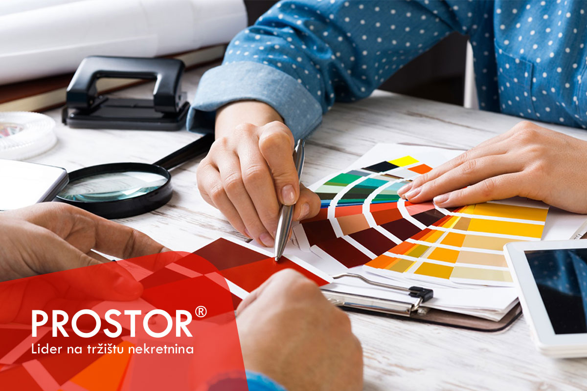
The invisible power of successful interior design and marketing – Color psychology in business space
In a time when psychological safety and the work environment are key to retaining top talent and building customer loyalty, a space that understands the power of color is a space that builds the future.
Color as the silent ambassador of a brand
In a world where competition is rising and client attention spans are shorter than ever, every detail plays a crucial role in shaping brand perception. One of the most powerful—yet often overlooked—tools in the arsenal of business success is color. The psychology of color in business spaces is not just an aesthetic consideration, but a tool of communication, identity, and consumer behavior.
Colors influence our emotions, cognition, and decision-making—often on a subconscious level. When properly implemented in interior design, they can improve productivity, boost sales, enhance brand image, and create emotional connections with customers.
In this article, you’ll discover how color psychology is applied in business space design, which colors stimulate specific behaviors, and how a smart choice of color palette can improve marketing effectiveness and user experience.
Interior design as part of the marketing strategy
The space you work in becomes a physical extension of your marketing. Clients, customers, and partners form impressions of your brand, professionalism, and credibility not only through communication but also through the ambiance they experience. Color is the first message you send—even before anyone speaks.
A well-thought-out use of color can increase client retention, stimulate purchasing behavior, and guide movement throughout the space.
Interior design also impacts employee motivation, team dynamics, and stress levels.
Key colors in business environments and their psychological effects
Blue
Blue symbolizes stability, trust, logic, and calm. It is used in the interiors of companies aiming to project professionalism and rationality—such as banks, insurance companies, IT and software firms, pharmaceutical industries, and educational institutions. Light blues bring freshness and openness, while darker tones convey seriousness and reliability. Psychologically, blue lowers blood pressure, calms the nervous system, and enhances long-term focus—making it ideal for spaces requiring a high degree of concentration and analytical thinking. That’s why blue is often dominant in corporate offices, meeting rooms, and individual workspaces.
Red
Red provokes strong emotional responses and grabs attention. It is used in branding products that convey power and luxury. It’s present in sectors where pace, speed, and intensity are critical—like advertising, sales, marketing agencies, retail, and creative industries. Its presence can stimulate action and quick decision-making, but in excess, red may cause anxiety, aggression, or discomfort. It’s most effective in high-traffic areas like shared spaces or team meeting rooms, where it acts as a visual stimulant.
Green
Green brings balance and a sense of natural connection to the work environment. It symbolizes growth, calmness, and renewal—drawing from its direct association with nature. It is frequently used in companies that promote creativity, flexibility, and sustainability—like IT firms, design agencies, and biotech startups. Green elements—whether on walls, decor, or through plants—help reduce stress, relax the eyes, and improve focus, especially in spaces with lots of screens and artificial lighting.
Yellow
Yellow symbolizes optimism, creativity, and mental stimulation. As the brightest color on the spectrum, it brings cheerfulness and encourages communication. It’s a common choice in creative industries, education, and marketing. Yellow works well in brainstorming zones, team spaces, and informal meeting areas where idea exchange is essential. It’s best used as an accent—on furniture, details, or decor—alongside a neutral base, as too much yellow can cause discomfort or tension. When used wisely, yellow creates a space that feels inspiring, open, and motivating, directly supporting innovation and team energy.
White
White, often used as a base tone in office spaces, symbolizes clarity, purity, and openness. Its ability to reflect light and visually expand a room makes it ideal for smaller offices and shared spaces in companies valuing transparency, minimalism, and order—such as law firms or medical practices. However, excessive use of white without warm or contrasting elements may feel sterile and impersonal. That’s why it’s often combined with natural textures or warm accents for better balance.
Gray and dark tones
Gray, a neutral and sophisticated color, is frequently used in offices of companies that want to project professionalism, maturity, and authority. It is common in financial institutions, consulting firms, and corporations that value stability and reliability. Gray is a great base for design as it pairs easily with bolder colors, but if it dominates without vibrant accents, it may evoke monotony and emotional distance.
Investing in thoughtful color use doesn’t require a massive budget—but it does demand knowledge, sensitivity, and a strategic approach. What you gain in return is a business space that not only functions—but inspires. A space where people don’t just work, but want to stay, create, and grow.
In a time when psychological safety and the work environment are key to retaining top talent and building customer loyalty, a space that understands the power of color is a space that builds the future.
Ena-Lemana S.

